What is UX Accessibility
Let’s start with a dream example where we came up with a product planning with an elegant design and pinpoint engineering work. But what if at the end we see only a percentage of people can use our products only. But why? We often forget about one thing, in this diverse world – we may build a perfect product but humans are not perfectly equal.
To make a design that is accessible by all the people regardless of their languages, physical disabilities or even circumstantial problems (e.g: tough schedules). A design that meets these requirements is an example of good UX accessibility.
Statistics
According to WHO, there are currently 2.2 billion people who have vision impairment or similar problems. Even if we consider that only one fourth of people use software based products then we are talking about half of a billion people who cannot use the product or service if it does not support accessibility for them. This result is only for visually impaired groups. The combined results of all other disabilities are much larger.
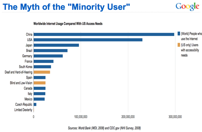
This picture from 2008 published by the World Bank shows that only the USA has more minor users than normal users from other countries.

Types of accessibility and guidelines
There are numerous types of accessibility. Out of these Web Content Accessibility Guidelines(WCAG 2.1) mentioned four major ones –
- Perceivable
- Alternative text for accessibility. If a user interface content is anything other than text. Then these contents should have a text alternative like large text for visual imperials, sound option for hearing imperials, plain and easy language for foreign people or multiple language options, braille keyboard option for blind users and similar alternatives.
- Provide alternatives for time based content like a video, slideshow, carousel and so on. For example, add subtitles or playback speed options.
- Multiple layouts for presenting any content without losing valuable information. We can compare it to responsive mobile views but in this case we need to provide layouts based on different disabilities.
- Provide a way to distinguish between foreground and background. It helps most users who are having color blind issues. It is recommended to use additional text or something while showing state based text on the screen. Because a colorblind person may not catch the difference.
- Operable
- For most of the general people using a mouse is normal but there is a certain group of people who cannot access this. So, it is recommended to build a keyboard friendly solution where everything can be done from a keyboard. For example: travel though the whole interface in order just through the ‘tab’ key on the keyboard.
- In movable animations, make the speed where the majority of people can read or understand the information. Although a configurable speed option would be the most optimal choice.
- Searching is one of the most popular features for any kind of product. Multiple search interfaces should be implemented, like search by voice, search by an image, read the search results loudly etc.
- Make the navigation easy and moderately large to see for all screen sizes.
- Understandable
- Build a predictable user interface. Actually it is a good practice to make the interface so easy that users do not need to guess anything to complete a task. It improves the overall usability of an application.
- Refrain users from making a mistake. Most people having physical disabilities are prone to make more mistakes than general. So UX should have a way to prevent that.
- Robust
- For years, communities are trying to make a good environment for the target physical disabled user group. As a result they have built many tools already and there will be new ones. So, it is important to make sure that there are no compatibility issues when there is a change.
Here is a list of tools to verify different kinds of accessibility according to the WCAG Guidelines.
Conclusion
As today, to achieve AAA compliance there are more than 40 countries who have their own accessibility rules to overcome this major problem worldwide. All these rules are certified by WCAG 2.0.
UX accessibility is not something that only solves problems for a portion of the people. A good design is always a good design. In today’s world, there are still so many applications that are more complex that they should. So, it’s a good choice to build something simpler but more accessible.
